Carter Brobbey
DESIGN OVERVIEW
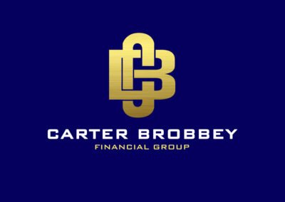
They are a financial service company owned by two and wanted that partnership to reflect in their visual identity. So we took it a challenge to create a mark using their initials then merging them together to represent their partnership and also depict a bold and trustworthiness as we considered that in the choice of font.
CLIENT
Kobe Brobbey
INDUSTRY
Finance
SERVICES
Logo Design
OUR
APPROACH
Custom-made for each client
They made a request for the design of their logo giving us the freedom to explore without limitation. So we decided to go with a combination mark by creating a mark using the first initials of the company name to create versatility with both the text and mark working together to reinforce the brand. The choice of font is “BANK GOTHIC” as the title suggests a state in financial institution. This font choice suggests stability.
After considering other colour combination we finalized on Gold andS a Darker shade of blue signifying wealth and confidence respectively.
